User Interface
5. USER INTERFACE
The Omnivex SCADA user interface is designed to effectively manage industrial automation processes. It features an accessible and user-friendly structure, incorporating modern visual and functional components that facilitate user interaction with the system. Tools have been developed to optimize the user experience and minimize challenges. The interface includes the following panels: Project Explorer, Workspace Area, Toolbar, Properties Window, and Status Bar. These panels can be hidden as needed.
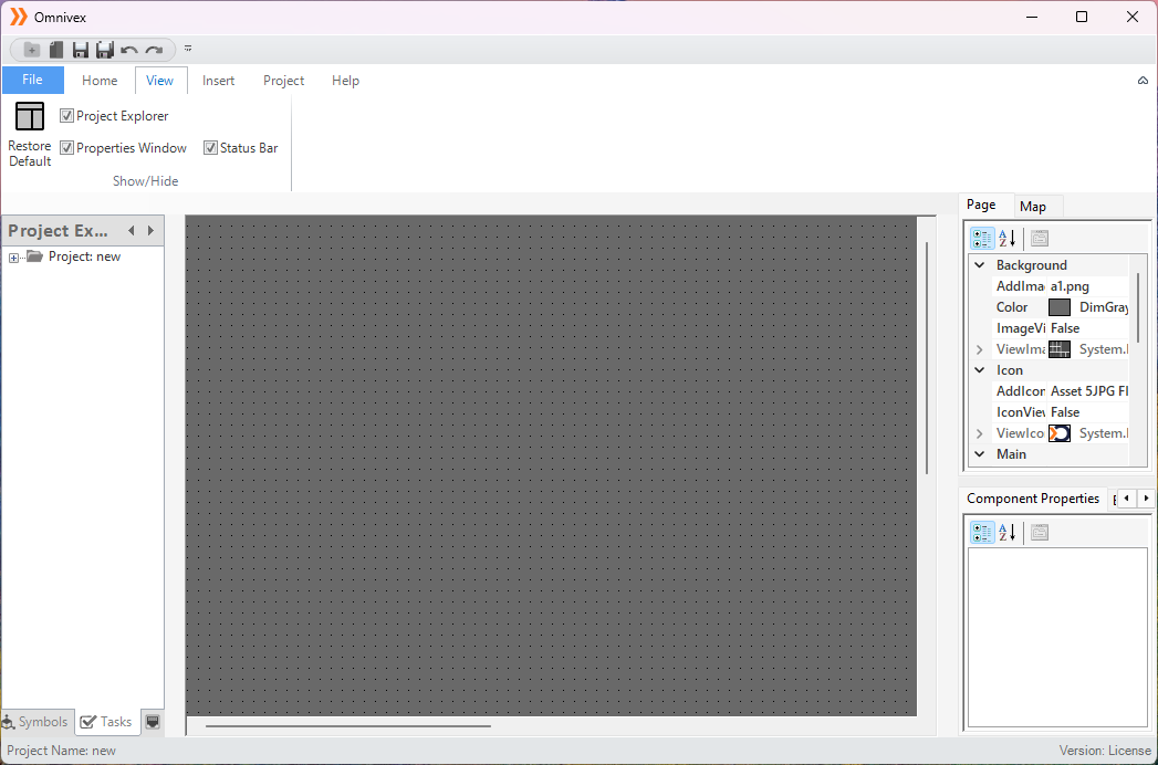
Figure 148 – Editor Interface
5.1 Project Explorer
The Project Explorer is a panel in Omnivex SCADA that displays and manages the entire project structure, providing quick access to SCADA components. It organizes components hierarchically for efficient management and enables users to quickly find specific elements.
Graphics: Enables the editing and viewing of project pages
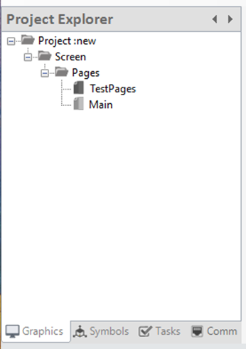
Figure 149 – Graphics Panel
Symbols: Users can add, edit, or delete project components.
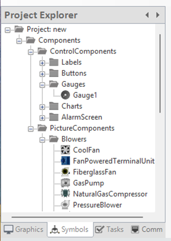
Figure 150 – Symbols Panel
Tasks: Provides access to alarms, recipes, data transfers, and reports, with options for editing.
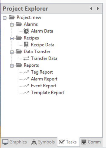
Figure 151 - Tasks Panel
Communication: Allows access to all details related to channels, frames, tags, and other communication elements.
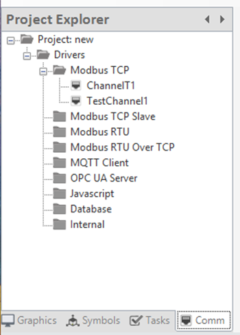
Figure 152 - Comm Panel
5.2 Workspace Area
The Workspace Area is the main space in the Omnivex SCADA interface where users design and modify their projects. It allows for the placement and customization of graphical components and offers features such as dynamic visualization, layered structure, and multi-component management. Additionally, the zoom-in/out function enables detailed adjustments and an overall view of the project.
Figure 153 – Workspace Area
5.3 Properties Window
Properties Window is a panel in the Omnivex SCADA interface that allows users to view and edit the properties of selected components. Through this window, users can easily modify attributes such as color, size, and position of graphical elements. Additionally, component labeling and function assignments can be done here. The Properties Window is where all page settings are configured, including page layout, background colors, and other related adjustments. Users can also modify the behaviors and functions of components, ensuring the project is fully customized and optimized.
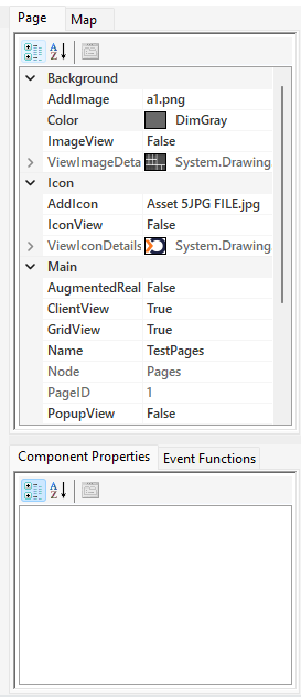
Figure 154 – Page Control Panel
Add Image: Adds an image to the page background.
Color: Defines the background color of the page.
Image View: Applies the image added to the page background.
View Image Details: Displays the details of the image added to the page background.
AddIcon: Used to add a logo to the project page.
IconView: Applies the logo added to the project page.
ViewIconDetails: Displays the details of the logo added to the project page.
AugmentedReality: Activates augmented reality functions.
Client View: Option to display the page on the client side.
Grid View: Offers the option to arrange page components in a grid layout.
Name: Defines the descriptive name of the page.
Node: Indicates the folder where the page is located or associated with.
Page ID: The unique identifier assigned to each page.
Pop-up View: Allows the page to be displayed as a pop-up window.
User Access: Determines user access to the page.
Height: Used to adjust the height of the page.
Width: Used to adjust the width of the page.
URL: Defines the address of external links to be opened on the page.
Zoom Info Value: Used to adjust the zoom level of the page.
5.4 Status Bar
The Status Bar is located at the bottom of the Omnivex SCADA interface and displays the project name and license status.
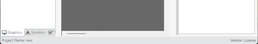
Figure 155 – Status Bar
5.5 Map Panel
The map page is a visual component used as part of SCADA systems. This page presents data and control information on a map that represents the geographic locations of physical assets (such as facilities, machines, or infrastructure elements).
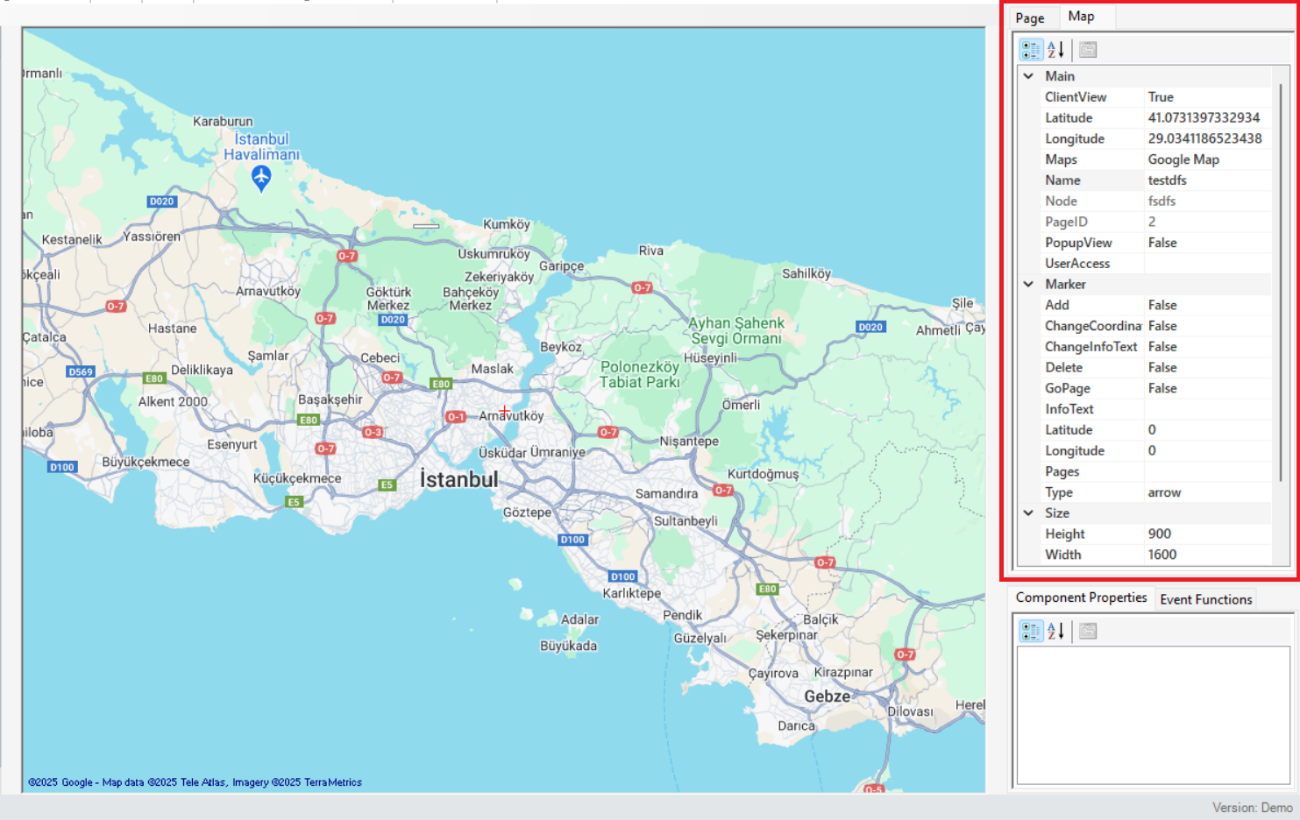
Figure 156 – Map Page Panel
The parameter descriptions are presented in the table below.
| “ClientView” | Option to display the page on the client side. |
|---|---|
| “Latitude” | Defines the latitude value of the point to be shown on the map. |
| “Longitude” | Defines the longitude value of the point to be shown on the map. |
| “Maps” | Used to select the type or source of the map to be used. |
| “Name” | Defines the descriptive name of the map page. |
| “Node” | Defines the network node associated with the map. |
| “PageID” | Specifies the unique identifier assigned to each map page. |
| “PopupView | Defines the window that opens when a point on the map is clicked. |
| “UserAccess”” | Determines user access to the page. |
| “Add” | Adds a new point or item on the map. |
| “ChangeCoordinate” | Allows changing the existing coordinates. |
| “ChangeInfoText” | Updates the text that provides users with information about the changes. |
| “Delete” | Deletes the selected items on the map. |
| “GoPage” | Allows navigation to a specific page. |
| “InfoText” | Function to generate a description or info text for display on the map |
| “Pages” | Defines the number or links of pages on the map. |
| “Type” | Determines the type of map (e.g., road, satellite, topographic). |
| “Height” | Used to adjust the height of the map page. |
| “Width” | Used to adjust the width of the map page. |
| “MaxZoom” | Defines the maximum zoom level that can be reached on the map. |
| “MinZoom” | Defines the minimum zoom level that can be reached on the map. |
| “ZoomChangeInfoText” | Displays a message confirming users' acknowledgment of zoom changes |
Tablo 22 – Map Page Parameters
Note: Under the "Marker" section, to make changes to the parameters "Add", "Change Coordinate", "Change Info Text", "Delete", and "Go Page", the option "False" should be changed to "True". After the relevant modifications are made, it should be switched back to "False". The system allows editing as long as the option is set to "True".
5.6 Component Control Panel
Component settings are parameters that define the behavior, appearance, and interaction of each component in Omnivex SCADA system. These features allow customization to optimize the functionality of the component and enhance the user experience.
The properties of the “Label” component are presented in the image below.
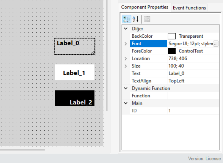
Figure 157 – Label Component
The properties of the “Button” component are presented in the image below.
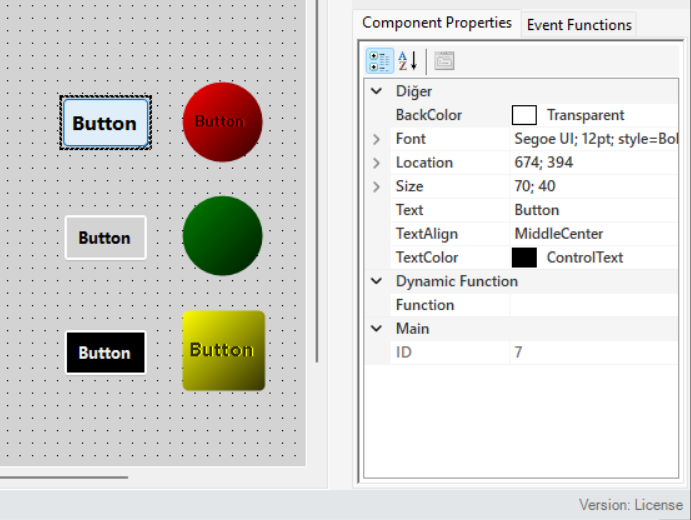
Figure 158 – Button Components
The properties of the “Gauge” component are presented in the image below.
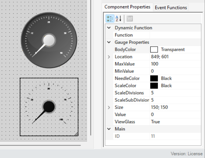
Figure 159 – Gauge Component
The properties of the “Graphic” component are presented in the image below.
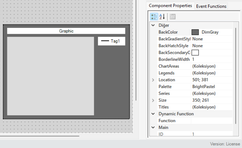
Figure 160 – Trend Component
The properties of the “Alarm Component” are presented in the image below.
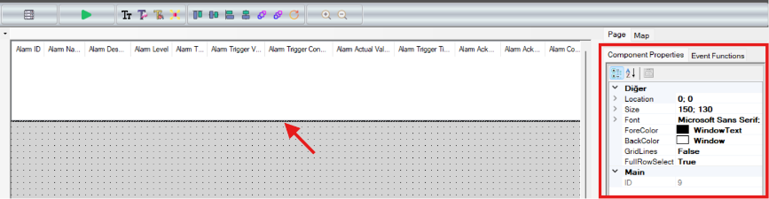
Figure 161 - Alarm Component
5.6.1 Event Functions
Different functions can be assigned according to the component properties. By selecting the relevant component, the necessary commands or actions are defined for the component under the "Event Functions" tab.
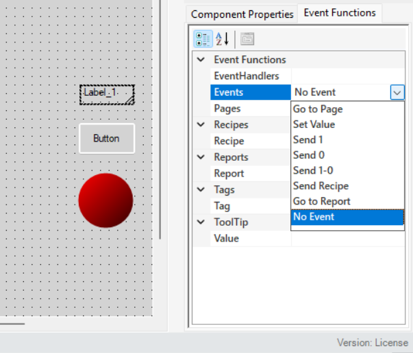
Figure 162 – Function Panel
The parameter descriptions are presented in the table below.
| “EventHandlers” | Defines the triggering method for the component. |
|---|---|
| “Events” | Specifies the event command to be assigned to the component. |
| “Pages” | Adds page redirection to the component. |
| “Recipe” | Defines a recipe for the component. |
| “Report” | Assigns a report to the component. |
| “Tag” | Defines the tag that the component will control or receive data from. |
| “Value” | Specifies the data to be sent when data transmission is defined for the component. |
Table 23 - Function Parameters